

Why Do Some Uniforms Look Like Event Shirts?
The design choices that make a company uniform feel temporary or promotional, and how to create a more lasting corporate look.
Some uniforms look like event shirts because they use the visual language of temporary promotion instead of long-term workwear.
Large slogans, multiple logos, oversized back graphics, bright campaign colours and crowded information can be useful at an event. Used every day, the same treatment can make a company uniform feel temporary.
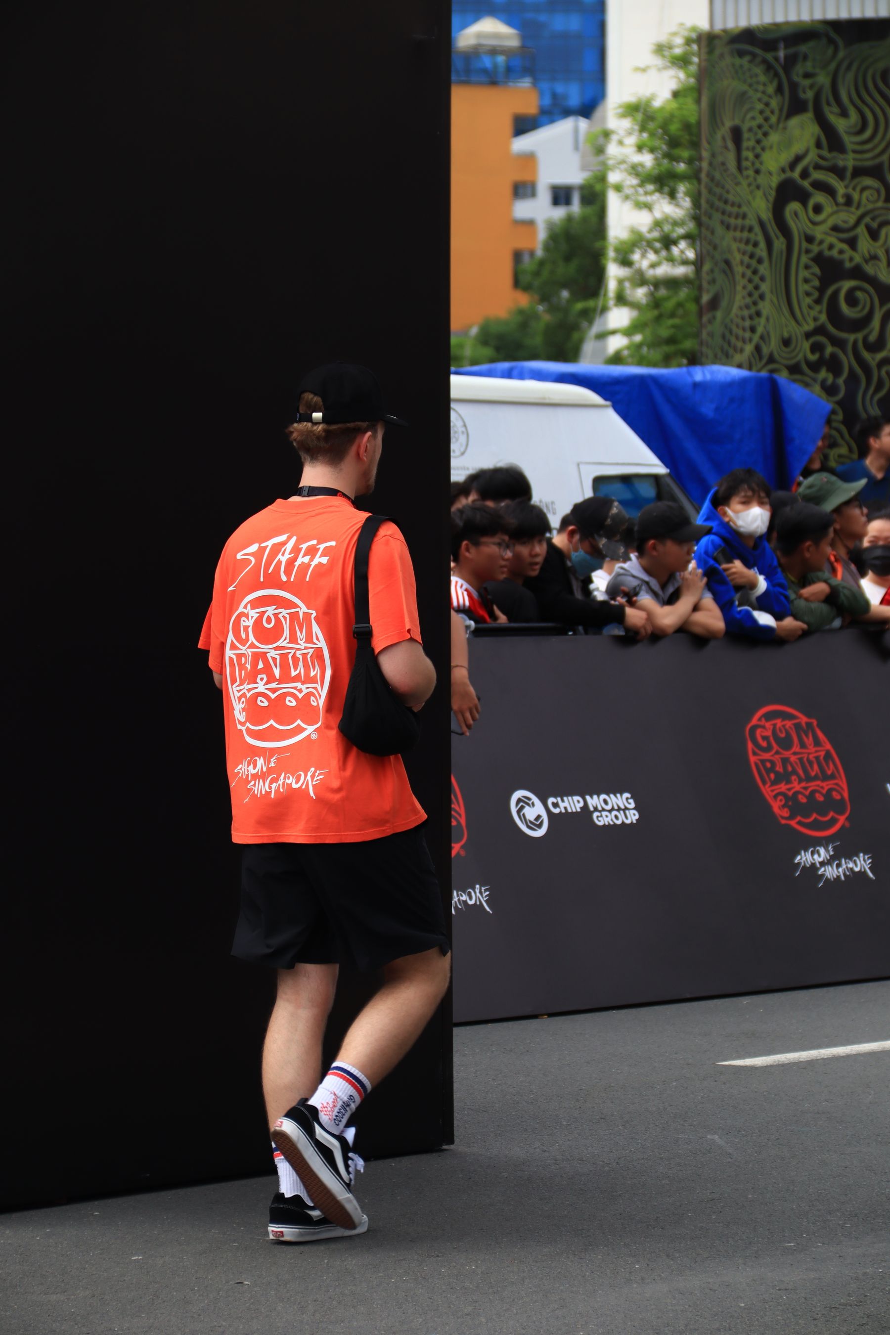
Event Shirts Are Designed to Be Noticed Quickly
At a roadshow, race, launch or campaign, staff may need to be obvious from a distance. Large text and strong contrast help visitors identify organisers and sponsors quickly.
That is a different design problem from a uniform worn five days a week for several years.
Five Signs Your Uniform Is Starting to Feel Like an Event Shirt
Huge Back Logo
The branding dominates the person rather than supporting the overall uniform.
Too Many Messages
Website, slogan, phone number, services and campaign text all compete for attention.
Too Many Colours
Every brand colour is forced onto one shirt instead of creating a controlled palette.
Sponsor-Style Placement
Several unrelated logos appear across chest, sleeves and back.
Temporary Theme
The design follows a campaign that may look dated long before the garment wears out.
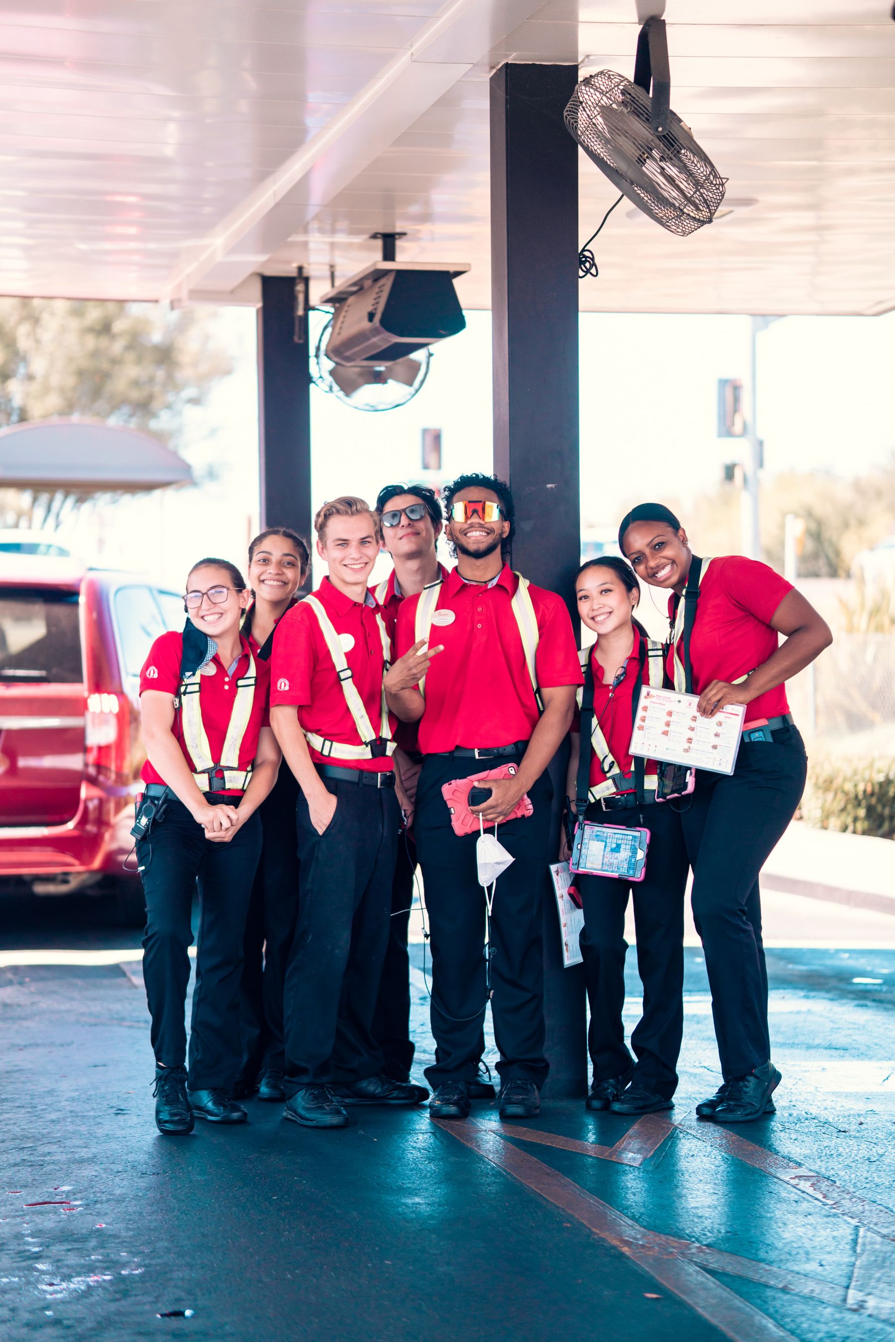
A Company Uniform Usually Needs More Restraint
Daily uniforms benefit from repeatability. The shirt should still make sense when a new employee joins next year, when a manager stands beside an operations employee and when the company updates a marketing campaign.
Temporary Visibility
Large graphics, campaign messages, sponsor logos and highly noticeable colours can be appropriate for a short-term activation.
Long-Term Recognition
Controlled logo size, stable colour palette, consistent garment style and purposeful role differences create a more lasting identity.
How to Make the Design Feel More Like a Uniform
- Keep the primary logo clearly visible without making it oversized.
- Reduce unnecessary wording on the garment.
- Use one main colour system instead of turning the shirt into a brand-colour chart.
- Keep campaign or promotional information on removable items where possible.
- Think about how the same design will look in photographs, meetings and normal daily work.
There Is Nothing Wrong With Looking Like an Event Shirt When It Is an Event Shirt
Different tools solve different problems. If the garment is for a three-day exhibition, charity run or product launch, stronger promotional graphics may be exactly right.
The mistake is using the same design logic for a permanent staff uniform without considering how it will age.
Design for the Life of the Garment
If staff will wear it for years, the visual identity should last longer than the current campaign.
Frequently Asked Questions
Can a company uniform have a large back logo?
Yes. It can be appropriate for visibility. The question is whether the scale supports the brand or makes the garment feel mainly promotional.
Should staff uniforms include phone numbers and websites?
They can, but every extra message adds visual complexity. Include information only when it serves a clear operational or marketing purpose.
Are bright colours unsuitable for uniforms?
No. Bright colours can work very well when they are part of a controlled brand system rather than several competing design elements.
Planning Company Uniforms in Singapore?
Tell us your staff roles, quantity, preferred style and branding requirements. We can help you compare practical uniform options for your team.
Discuss Your Uniform Requirements