

Don’t Do This When Designing a Company Uniform
Most bad uniforms do not begin with bad intentions. They begin with one extra colour, one larger logo and one more design element until the shirt is trying to communicate everything at once.
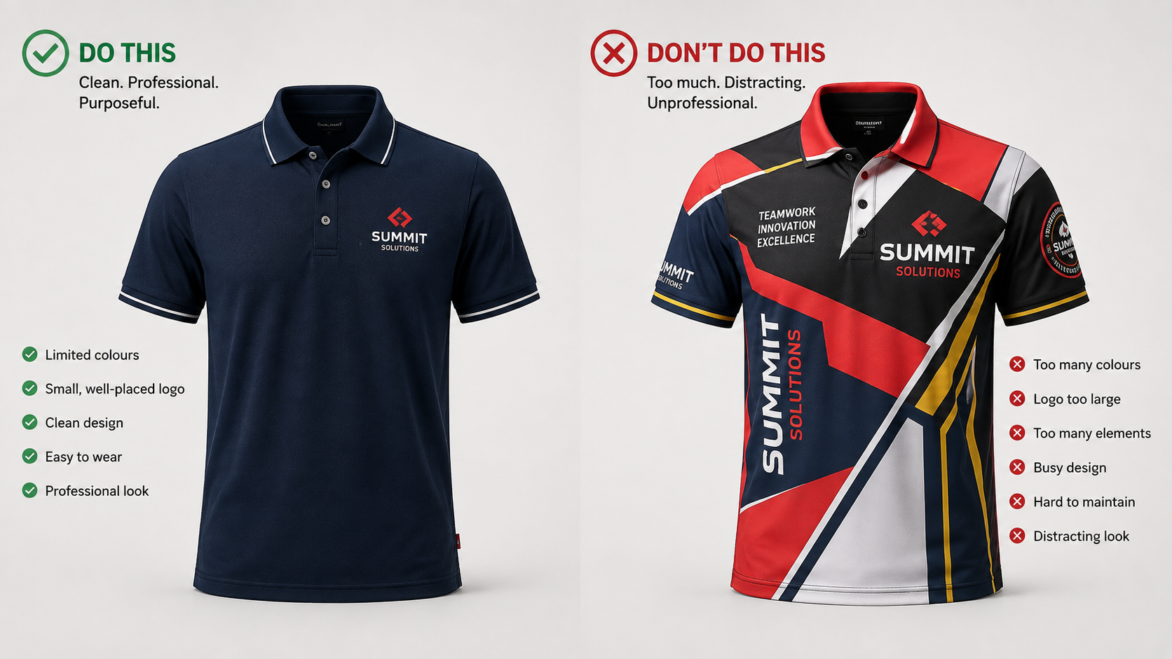
The easiest way to ruin a company uniform is to treat every empty part of the shirt as somewhere that needs another colour, logo or graphic.
A uniform is not a poster.
Employees wear it while sitting, walking, bending, meeting customers, travelling between locations and working for hours at a time.
That means a uniform has to work as clothing first and branding second.
Don’t Design Only for the Mockup
A uniform can look excellent on a clean digital template and still look awkward when a real person wears it.
Digital mockups usually show a perfectly flat shirt with perfect lighting and no movement.
Real uniforms have:
- Fabric folds
- Different body shapes
- Buttons and seams
- Arm movement
- Shirts being tucked or untucked
- Different sizes using the same artwork
A graphic that looks perfectly centred on a flat template can behave very differently once the shirt is worn.
If the design only looks good when the shirt is perfectly flat, it is not finished yet.
Don’t Put Every Brand Colour on the Shirt
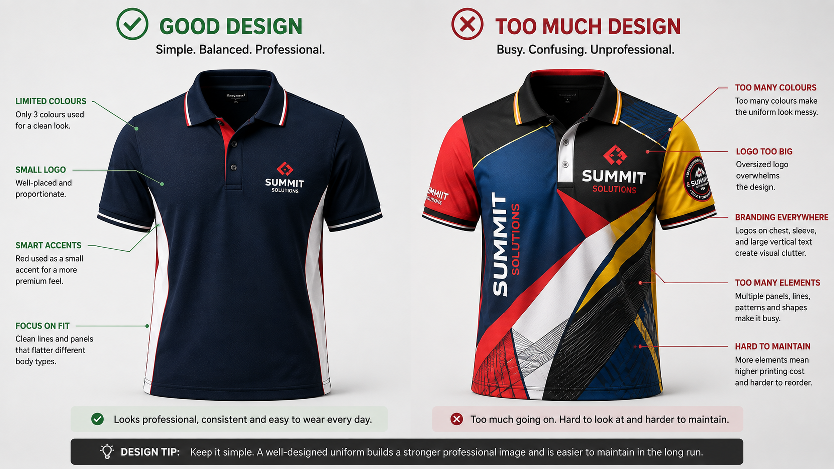
If your company identity contains red, blue, yellow and white, the uniform does not automatically need all four colours.
One colour can become the garment.
Another can become the logo.
A third can appear as a small accent.
That is often enough.
Main shirt colour plus controlled branding.
Useful when one colour is kept as a small accent.
Too many competing colours can weaken the overall identity.
Don’t Make the Logo Bigger Just Because You Can
There is a difference between making a logo visible and making it dominate the entire uniform.
On a corporate polo, a smaller chest logo often feels more intentional than a logo stretched across the front of the garment.
Controlled Logo Size
Suitable for office staff, customer-facing teams, management and everyday uniforms.
Large Graphic Branding
More suitable for campaigns, roadshows, events and promotional apparel where visibility is the main objective.
Bigger is not automatically more professional.
Don’t Put Branding Everywhere
Once companies discover they can print or embroider several locations, it becomes tempting to use all of them.
You could technically have:
- Left chest logo
- Right chest name
- Left sleeve logo
- Right sleeve wording
- Upper back company name
- Large back graphic
The question is not whether it can be done.
The question is whether all of it needs to be there.
Empty space is also part of the design.
Don’t Pick the Fabric After Finishing the Design
Fabric changes what is technically possible and what actually feels good to wear.
A thick structured polo behaves differently from a lightweight performance shirt.
Large embroidery can add stiffness.
Large printed areas can affect how some garments feel.
Panels, piping and seams also interact differently with different fabrics.
| Design Decision | Why Fabric Matters |
|---|---|
| Large Embroidery | Lightweight fabric may not support heavy stitch areas as well as a more structured garment. |
| Large Printing | Print method and fabric should be considered together. |
| Custom Panels | Added seams change both appearance and garment construction. |
| Outdoor Uniform | Breathability and drying performance may matter more than decorative details. |
Don’t Forget That Employees Have to Move in It
A uniform can photograph beautifully and still be uncomfortable during a full workday.
Think about what the employee actually does.
| Role | Movement to Consider |
|---|---|
| Office Staff | Sitting for long periods, commuting and meetings |
| Retail Staff | Reaching, bending and long hours standing |
| Warehouse Staff | Frequent arm movement and physical activity |
| Technicians | Bending, reaching, kneeling and outdoor movement |
If a design interferes with normal movement or makes employees dislike wearing the shirt, it is not a successful uniform design.
Don’t Design Only for the First Order
This is one of the least visible mistakes because nothing appears wrong when the uniforms first arrive.
The problem appears months later.
A new employee joins.
Someone damages a shirt.
A new branch needs twelve more pieces.
Suddenly the company discovers that the exact fabric, colour, panel or shirt model is difficult to reproduce in such a small quantity.
“If we need another five uniforms next year, can we realistically produce or reorder them?”
What This Means for Your Company
A professional uniform does not need to prove how much design work went into it.
The best designs often feel simple because every element has a reason to exist.
Start with the employee, the working environment and the garment.
Then add the minimum branding needed to make the uniform recognisable, practical and consistent.
Before You Approve the Uniform Design
| Check | Question to Ask |
|---|---|
| Colour | Are we using these colours because they help the design? |
| Logo Size | Is it clearly visible without dominating the garment? |
| Logo Positions | Does every branding position have a purpose? |
| Fabric | Does it suit the actual work environment? |
| Fit | Can employees move comfortably? |
| Maintenance | Can staff realistically wash and care for it? |
| Reordering | Can we reproduce the same uniform later? |
Frequently Asked Questions
How many colours should a company uniform have?
There is no fixed number, but fewer well-controlled colours usually produce a cleaner result than trying to use every colour in the company's brand identity.
Should the company logo be large on the shirt?
It depends on the purpose. Corporate uniforms usually benefit from controlled chest branding, while large graphics are more suitable for events and promotional apparel.
Is a more complicated uniform design more expensive?
It can be. Additional panels, colours, embroidery positions, printing and specialised construction can increase production complexity.
Should employees see the design before production?
For larger uniform programmes, feedback from people who will actually wear the garment can help identify comfort and practical issues that may not be obvious from a visual mockup.
Should we order a sample first?
A physical sample can be very useful when fabric, colour, fit, placement or custom construction is important to the final order.
Before You Finalise Your Uniform Design
Send us your artwork or current uniform concept. We can help review the garment, logo placement and customisation before production.
Review My Uniform Design