

Sublimated Jersey Numbers: Keeping Them Readable on Patterned Designs
Full-print sublimation can put colour and pattern almost anywhere on a jersey. That freedom creates a specific design problem: a player number can disappear into a busy background even when the artwork looks impressive at full screen size. A reliable number system must work on the finished garment, from a realistic viewing distance, across every team size.
In This Article
Direct Answer
Build a quieter, high-contrast zone behind each number, test the back of the jersey at real size and from several metres away, and approve the result on a sewn sample. Number legibility is a visual design decision, not a property guaranteed by sublimation.
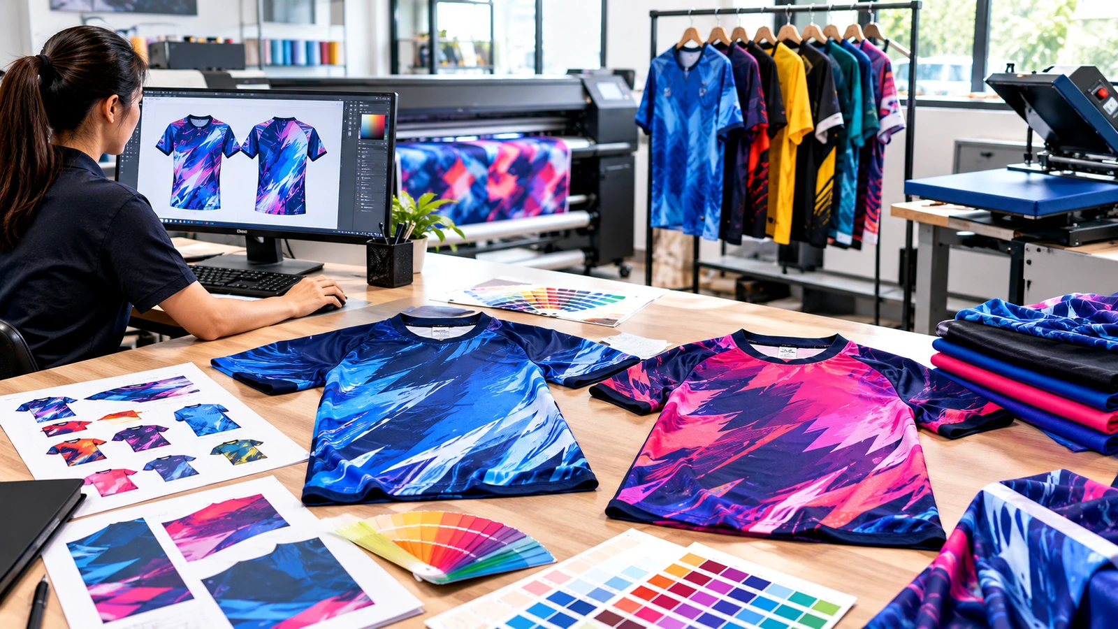
Treat the number as information, not decoration
A number is usually the fastest way to identify a player from behind, so it needs to compete successfully with the surrounding design. A thin outline may look elegant in the artwork file but disappear against an equally busy pattern at a distance. First identify the intended number zone and give it visual priority: fewer abrupt colour changes, less high-frequency detail and enough separation from neighbouring sponsor graphics. A solid panel is one solution, but a quiet gradient or low-contrast texture can preserve the character of the jersey. Test a real two-digit combination, not only a single digit, because the two characters occupy more width and may approach side seams. When choosing a typeface, inspect the openings and distinctive shapes of digits such as 3, 5, 6 and 8; highly stylised forms can become difficult to distinguish during play.
Check contrast against every part of the pattern
A white number on a navy background is easy to assess, but a white number that crosses navy, pale blue and cream is not consistently separated from its surroundings. Evaluate the weakest part of the number, not its average appearance. If the design uses a light-to-dark gradient, consider a dedicated backing shape or relocate the number into the more stable colour zone.
An outline can help when the background is moderately varied, yet an outline alone may be insufficient over dense geometric motifs. For an informal comparison, print two alternatives at actual back-panel scale, hang them vertically and walk back until fine details disappear. A phone screenshot is a poor substitute because screen brightness, zoom and backlighting flatter weak contrast. Record the chosen number fill, border and background colours so new player numbers do not drift into inconsistent treatments.
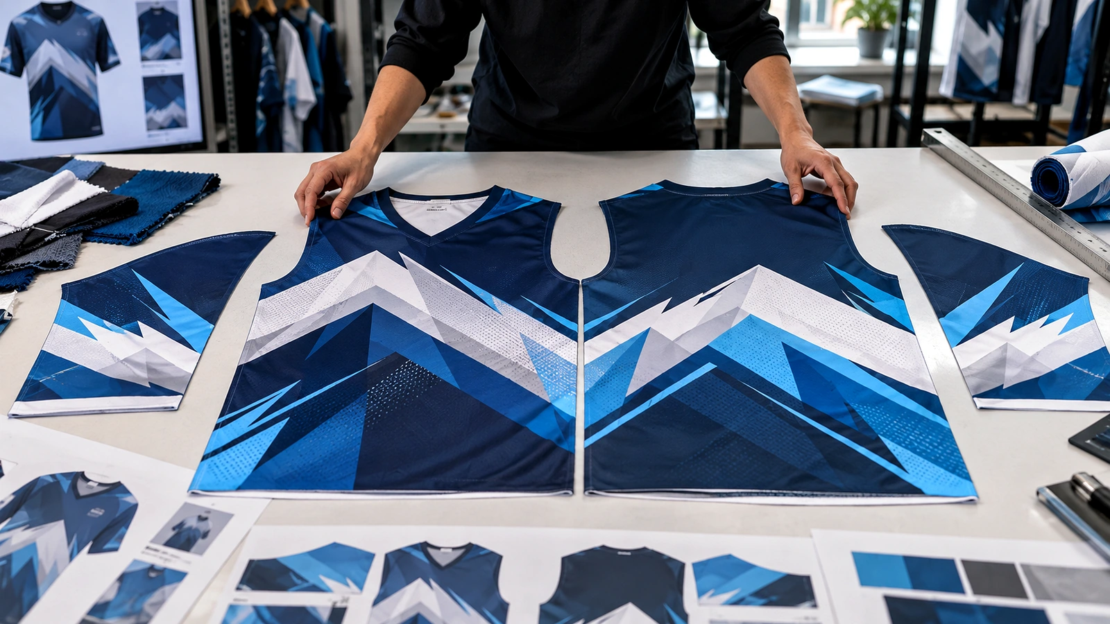
Allow for smaller sizes and curved bodies
A layout approved on an adult XL mock-up may not translate cleanly to a youth size or a very small adult jersey. The usable back width changes, while the minimum readable digit stroke does not shrink at the same rate. Ask the supplier whether number dimensions stay constant, reduce by size group or follow a maximum-width rule.
For example, if the available safe width is 250 mm and a two-digit number is 220 mm wide, the nominal side clearance is only 15 mm on each side before movement and sewing tolerance are considered. On a smaller panel, the same number could become cramped. Check the number against the pattern pieces and on a person or mannequin, because the fabric curves and stretches rather than hanging as a perfectly flat rectangle. Keep the critical digits away from high-distortion areas such as side seams and strong body contours.
| Number treatment | Strength | Main watch-out |
|---|---|---|
| Solid contrast zone | Reliable separation from busy patterns | Can look visually heavy |
| Subtle quiet gradient | Preserves more of the design | Must remain quiet behind all digits |
| Outline only | Minimal change to artwork | Can fail on high-detail backgrounds |
Run a distance-and-motion approval test
Make one complete sample using the intended fabric, sublimation process and sewing construction. Place the jersey on a person and view it from the distance at which teammates or officials will normally identify the number. Test under bright light and ordinary indoor light if both settings are relevant; a glossy digital rendering is not a lighting test.
Ask someone unfamiliar with the design to read several numbers quickly while the wearer walks or turns. Note any digit pair that causes hesitation and adjust the typeface, contrast or background rather than assuming the viewer will learn the design. Photograph the final sample front and back, and save the approved digit artwork separately from the decorative panel artwork. If a competition imposes number-size or colour rules, check those event-specific rules before production; this article does not replace them.
Keep later player additions consistent
Team lists change after the first order, so the number system should be reproducible. Store the digit font or outlined shapes, number height, stroke thickness, outline width, placement reference and colour values in one approved master. If the artwork uses individual named player panels, check whether the supplier can produce one replacement jersey without recreating the design manually. A new number on the same pattern should not require a new visual judgement every time. Before ordering, request a mock-up of the smallest and largest size, plus the longest two-digit number combination expected. This small amount of standardisation protects the team identity more effectively than approving only a beautiful hero render.
The most useful number test is a stranger reading the sewn jersey quickly from a realistic distance.
Frequently Asked Questions
Can a number sit over a full-print pattern?+
Yes, provided the number retains strong contrast across the entire area it covers.
Should number size be identical on youth and adult jerseys?+
Not necessarily. Agree a size-group rule that balances legibility with safe placement.
Does sublimation make a number easier to read?+
No. Sublimation determines how colour is applied; readability comes from the design.
Discuss Your Print or Apparel Requirements
If your team is planning full-print jerseys, bring the pattern, size range and numbering rules together for a production-ready review.
Discuss Your Requirements