

How to Make Business Signage Readable From a Distance
Many signs fail because they are designed at laptop distance. A banner can look clean at 60 centimetres and become unreadable when the customer is walking past from ten metres away.
In This Article
Direct Answer
Design signage for the distance, speed and angle at which people will actually see it. Increase the size of the most important message, reduce competing information, use strong contrast, and test a full-size or scaled proof from the real viewing distance.
For building and accessibility signage, practical readability advice does not replace regulatory requirements.

1. Decide What Must Be Read First
A sign should have a reading order. Usually there is one primary message, one supporting line and one action. If five messages have equal size, the viewer has to work out the hierarchy instead of simply receiving it.
At an exhibition, the company name or main proposition may be primary. At a retail counter, the offer or direction may matter more. On a wayfinding sign, destination and arrow direction should win.
2. Design From the Viewing Position Backwards
Stand where the viewer will stand. Ask how long they have to look and whether they are moving. Someone walking through a mall has less reading time than a person waiting at a reception desk.
A useful practical method is the three-second test: show the sign at approximately its intended viewing size and distance for three seconds, then ask a colleague what they remember. If they cannot state the main message, the hierarchy is too weak.
| Viewing Situation | Design Priority | Common Failure |
|---|---|---|
| Reception / counter | Clear hierarchy and comfortable reading | Too much small copy |
| Retail walkway | Fast recognition and strong contrast | Message only works close up |
| Exhibition booth | Brand + one proposition from distance | Crowded product list |
| Outdoor banner | Large message, simple layout, suitable media | Low contrast / poor image resolution |
| Wayfinding | Destination and direction first | Decorative styling competes with navigation |
3. Contrast Matters More Than Decorative Effects
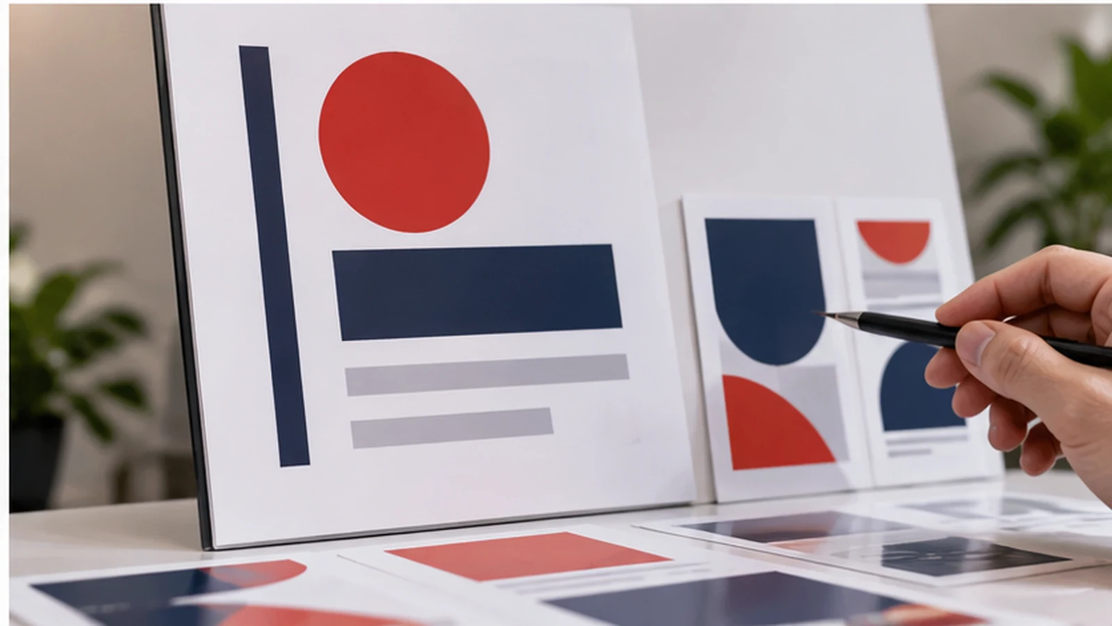
High contrast between text and background generally improves legibility. Busy photos, gradients and reflections can reduce it. Thin white text on a bright photograph may look elegant on screen but disappear under venue lighting.
Use effects only when they support the message. Shadows, outlines and glows are not substitutes for proper contrast.
4. Material and Lighting Can Change the Result
Glossy surfaces can reflect overhead lights. Fabric banners can ripple. Outdoor boards may be viewed under harsh daylight. Large-format printing also reveals low-resolution images that looked fine on a monitor.
If the sign will be placed behind glass, under spotlights or outdoors, test those conditions before approving a large run.
5. Keep Accessibility and Compliance Separate From Marketing Taste
Singapore's BCA Code on Accessibility in the Built Environment sets baseline accessibility requirements for applicable building works. If a sign serves an accessibility, directional or statutory function, check the relevant requirements rather than relying only on a marketing-design rule of thumb.
This article is about practical communication. Compliance signage needs its own technical check.
6. Print a Section at Full Size Before the Final Job
For an expensive backdrop or permanent sign, print a representative section at 100% scale. Check type, line thickness, image sharpness and colour. Then step back to the intended viewing distance.
This catches problems that no PDF proof can reveal: type that feels too small, images that soften, or a colour combination that loses contrast in real light.
The Best Sign Is the One People Understand Quickly
A sign is not successful because every piece of information fits. It is successful because the right information is noticed and understood in time.
Design signage at the distance where it has to work, not at the distance where the designer happens to be sitting.
Frequently Asked Questions
How large should sign text be?+
There is no single size for every situation. Viewing distance, viewing time, typeface and environment all matter; test from the real position.
Is a high-resolution file enough for a large banner?+
Resolution helps, but hierarchy, contrast and viewing distance still determine whether the banner communicates.
Does this guide replace BCA signage requirements?+
No. Where accessibility or statutory requirements apply, use the relevant Singapore codes and project requirements.
Producing a Banner, Backdrop or Display?
JCP's current printing capabilities include banners, flags and display stands. For large-format work, provide the final size and intended viewing environment so artwork can be checked before production.
Discuss Your Display Project