

Design
QR Codes on Business Cards: Print Size, Contrast and Scan Testing
A QR code on a business card can take someone straight to a contact page, menu or portfolio, but a code that scans on a monitor does not automatically scan after printing. Its performance depends on physical size, contrast, surrounding space, paper finish and the destination behind the link. The best approach is to design it as a functional printed element, then test a real proof with ordinary phone cameras before committing to a full run.
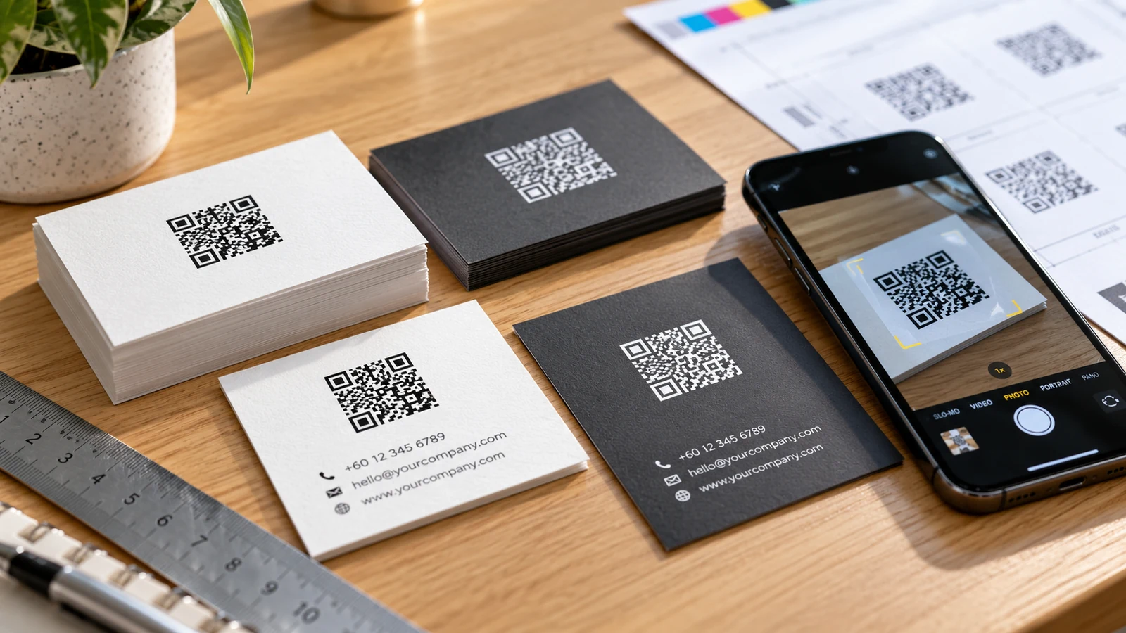
Decide what the QR code should actually do
Start with the next action, not the graphic. A visitor receiving a sales card may want to save contact details, while someone at a trade show may prefer a short product overview. Sending everybody to the home page can create unnecessary taps. Use a destination that matches the card’s message and remains useful after the original campaign ends. Confirm that the link is accessible on mobile devices without requiring special software or a login.
Dynamic QR services can make destination changes possible without reprinting the visual code, but they add dependency on an outside provider and sometimes a subscription. A static code points directly to a fixed destination and may be easier to maintain, provided the link itself is stable. Decide who will own the destination, what happens if the website is redesigned, and how the business will monitor links after staff changes. A working printed code is also a long-term maintenance commitment.
Protect the code’s quiet zone and module clarity
The small square cells in a QR code must remain distinguishable after printing. If the artwork is reduced too far, ink spread, coating and viewing distance can make individual modules blur together. A useful starting point is a compact but comfortably scannable code, followed by proofing at the exact intended size; there is no single minimum dimension suitable for every data length and printing process. Longer encoded content generally makes the pattern denser.
Every QR symbol needs a blank margin around its perimeter, known as the quiet zone. Do not crowd it with a coloured border, phone icon, decorative pattern or nearby text. Preserve the generated file as vector artwork where possible so the edges remain sharp, but remember that a vector file cannot fix a poor design choice such as a dense code printed very small. Leave additional breathing room if the card has a textured background or an elaborate decorative frame.
Choose contrast for cameras, not just for appearance
Black on a light, solid background is a reliable starting point. Reversed codes, pastel colours, metallic ink and gradient backgrounds may look elegant in a brand mockup yet perform inconsistently across phones. Glare from glossy finishes can also interfere with scanning under directional lighting. If corporate branding requires a nonstandard colour, test it with several devices under the lighting where the card will be used rather than assuming software will compensate.
Do not treat colour appearance on a computer as a press proof. Printed dark blue, black, gray and deep green can differ from their screen equivalents. Use enough separation between the cells and the background after conversion to the printer’s colour workflow. A logo embedded in the centre may be supported by the code’s error correction, but it also reduces the amount of useful information available to scanners. Test the exact final code, not a similar online sample.
Match card stock and finishing to the scanning task
Coated card offers crisp visual reproduction, while uncoated paper can feel tactile and make handwritten notes easier. Neither surface guarantees reliable scanning. Very heavily textured stocks can break up small modules, and some special finishes create glare. A matte surface may reduce reflections in certain conditions, but the actual lamination, ink and lighting combination matters more than a generic finish label. Ask for a physical sample when selecting unusual papers.
Think about how the card is handled. Rounded corners and heavier stock can make the card feel more robust, yet the QR symbol should remain well inside trim and fold areas. Do not put essential code elements over an embossing feature, hole or edge. JCP lists name cards and office printing within its verified capabilities; the exact stock, lamination and print method should still be agreed for the job being quoted.
Perform a genuine print-and-scan approval
The most meaningful proof is not a PDF displayed at 300 percent zoom. Print a test at actual size on a material and finish representative of the final card. Scan it using a range of normal mobile phones, at typical hand-held distance, in bright and ordinary indoor lighting. Check how quickly the phone recognises the code, whether the link opens the intended page, and whether that page behaves well on a small screen.
Record the approved QR code image and URL together. If someone changes the website address or redirects traffic after the proof has been signed off, repeat the test. Check both sides of a double-sided card, including whether the code competes visually with a phone number or email address. A QR code should be an extra route to the business, not the only usable contact method; printed contact details remain valuable when the code cannot be scanned.
Prepare the artwork handoff and post-print checks
Ask the printer about finished size, bleed, safe margins and accepted file format before exporting. Provide a print-ready PDF containing the code as sharp vector geometry or a high-quality image at final scale. Where the QR element is black, avoid complicated effects that change the edges. Keep the file named and dated clearly so an older version from a previous sales campaign cannot accidentally replace the approved one.
When the finished cards arrive, inspect several from different positions in the pack. Check trimming, colour, code sharpness and scanning performance; do not rely solely on the first card. If the order is distributed across departments, make sure staff cards point to the right personal details, especially when separate codes were generated. A small approval checklist protects the card’s basic promise: someone can receive it, recognise the brand and reach the correct destination quickly.
Frequently asked questions
Can I use a free QR-code generator for a business card?
Yes, if the resulting code and destination are reliable. Verify that the link is permanent, the exported artwork is high quality and any dynamic-code service terms are understood.
Will glossy lamination always stop QR scanning?
No. Many glossy cards scan well, but reflections can cause problems under particular lights. Test the chosen stock and finish at actual size.
Can I hide a logo in the middle of the code?
Sometimes, but it removes usable code area and may weaken scanning. Use it only after printed proof tests across more than one phone.
Should a card still include printed contact information?
Usually yes. Names, phone numbers and an accessible web address give recipients a fallback and make the card useful even when scanning is inconvenient.
Preparing an order? For garment, artwork and print specifications, consult JCP’s official printing-service information and request a quotation for the exact item and quantity.