

General
Branded Corporate Notebooks: Cover Stock, Binding and Logo Placement
A notebook makes a sensible staff or client gift only when it is pleasant to write in. An attractive cover may win initial attention, but poor binding, paper that bleeds through or a cover logo placed directly under the user's hand can make the item frustrating. The most dependable buying process tests real everyday use: opening the notebook flat, writing with common pens and carrying it between meetings. Branding should support that function rather than compete with it.
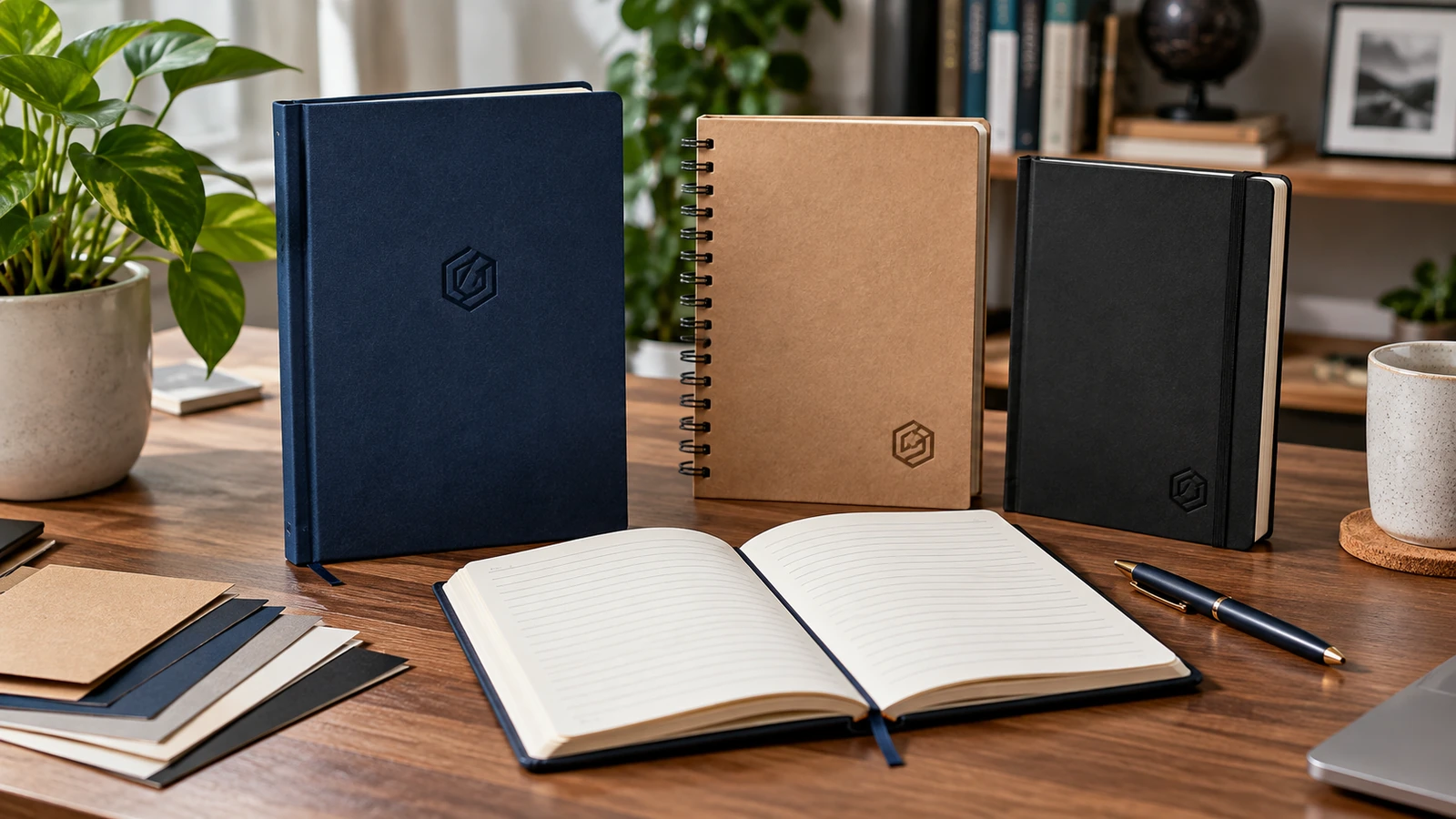
Decide how recipients will use the notebook
A meeting notebook, a pocket field pad and a desk journal have different dimensions and handling demands. For office staff, consider whether the notebook needs to lie nearly flat beside a laptop. For field teams, portability and a cover that survives being placed in a bag may be more important. Ask what recipients currently use and why. A fashionable format that does not fit the working habit may become an unused gift.
Estimate the intended writing life rather than guessing a page count. If the item is for a short workshop, fewer sheets may be sufficient. If it is for continuous daily notes, a thicker book or refillable system could be appropriate. Think about whether users need ruled, dotted, blank or numbered pages. One thoughtful interior choice can improve utility more than an elaborate decorative cover.
Compare cover feel and durability
Paperboard covers can provide a good printed surface but vary substantially in resistance to scuffs and bending. A heavier cover may feel substantial without necessarily being flexible enough for comfortable writing. Fabric-look and synthetic covers can add texture, although their surface may limit fine printed details or change how foil, embossing or transfers behave. Select the cover by expected use and ask the producer to confirm which decoration treatments are compatible.
Test the cover under real handling. Put the sample in a handbag or backpack with a laptop charger for several days and check corners, surface rub and spine condition. Dark surfaces can show scratches more visibly than medium-toned ones. A premium finish that looks immaculate in a product photo may need a protective sleeve for distribution. The practical question is whether recipients can keep using it without the cover quickly looking tired.
Choose binding by opening behaviour
Wire-o, spiral, stitched and adhesive-bound notebooks open differently. A wire or spiral system can allow pages to fold back, which is helpful in narrow spaces; however, the coil may snag loose items and can feel awkward when the hand rests near the spine. A sewn or well-designed flat-opening book may feel more refined, but its flexibility depends on construction. Test the intended thickness before deciding.
Open the sample near the beginning, middle and end. Pages should not tear from normal turning, and the binding should not prevent writing close to the centre. If pages will be detached, check whether perforation is available and useful. Binding should be discussed alongside trim size and page count because a design that works in a thin sample may behave differently with many more sheets.
Test paper with the pens people really use
Paper smoothness and opacity matter more than a single impressive weight figure. An ink pen can feather or bleed through some stocks, while a pencil may feel too slippery on a highly coated sheet. Ask several likely users to write on a blank sample using ballpoint, gel and marker pens. Look at both sides under normal office lighting. If people will write on both sides, show-through becomes a practical concern.
Consider page colour and ruling. Very bright white paper can create strong contrast, but an off-white shade may feel easier to view under some lights. Faint ruling should support writing without competing with it. A page with decorative elements in every corner may use valuable space. Keep branding on the inner pages restrained unless the notebook is specifically a promotional booklet or event workbook.
Place the brand without weakening usability
A logo on the front cover should respect the binding margin and any fold or rounded corner. Embossing, foil or screen printing can create a subtle presentation, but the available detail and durability vary by cover surface. A tiny complex mark may lose clarity when embossed. Test logos at the actual size, not zoomed on screen, and avoid putting essential fine text into a reflective treatment that disappears in angled light.
Check the branding on an opened notebook too. A rear-cover imprint, inside cover message or belly band may sometimes be less intrusive than a large front logo. If the item is meant for clients, consider whether they would feel comfortable using it in many settings. A smaller, well-executed emblem can have better everyday value than a huge promotional slogan. This judgement should follow the audience, not just a marketing team's desire for visibility.
Compare total cost and approve a complete sample
The quote should identify finished size, page count, cover stock, inner paper, binding, printing colours, logo method, packaging and delivery arrangement. Avoid comparing two prices when one excludes finishing or assumes a different page count. For gifts distributed across branches, consider the space and weight of cartons. A beautifully rigid notebook is less attractive if it is expensive or impractical to ship safely.
JCP lists commercial printing and premium gifts among its wider offerings; a specific branded notebook format and finishing process should be confirmed before being promised. Request a complete pre-production sample rather than only a cover swatch. Ask staff to write in it for a day, inspect the logo for legibility and photograph the accepted version. That modest test is more useful than ordering from a digital mockup alone.
Frequently asked questions
Is a thicker notebook always better?
No. A thick book may be heavy or awkward to carry. Choose page count based on how long and where the recipient will use it.
Which binding is best for meeting notes?
A binding that opens comfortably and stays usable on a desk is the priority. Test a real sample instead of relying on style labels.
Should the logo be very large?
Not necessarily. Small, legible branding can feel more professional and may be more likely to be used by recipients outside company events.
Can I approve a notebook from a cover picture?
A cover picture is insufficient to assess writing paper, binding strength and opening behaviour. Obtain a full sample before a meaningful order.
Before you approve the order
Treat the notebook as a writing tool first and a branding surface second. Final approval should include the chosen cover, real inner paper, binding, logo treatment and packaging. A recipient who enjoys using the notebook repeatedly provides more useful brand exposure than one who merely keeps it on a shelf.