

Design
Countertop Display Cards: Designing Stable A5 and A4 Promotional Signs
A tabletop promotion competes with payment terminals, product samples, queuing notices and limited counter space. A sign that looks excellent in a flat artwork proof may flop, curl or block the staff member behind it after assembly. Choosing a printed counter card therefore means considering the physical structure as well as the graphics. The right design puts one message at eye level, remains stable on the actual surface and can be replaced without damaging the display.
Measure the real countertop footprint
An A4 sheet occupies a different visual space when displayed upright, folded into a tent or placed in a holder. Measure the available width, depth and clearance around the payment terminal and service opening. If the sign hides staff from customers or interrupts item handover, it is too intrusive even if the typography is attractive.
Use a cardboard dummy to test where customers naturally pause. A narrow A5 sign near the waiting point can outperform a large card placed beyond the customer flow. Observe whether customers approach from one side or both; a two-sided tent makes sense only if both faces can actually be read.
Record the chosen dimensions as erected dimensions rather than only flat sheet dimensions. This avoids a common print brief misunderstanding in which the designer and production team both agree on “A5” but mean different final shapes.
Decide between a folded tent, flat card and rigid stand
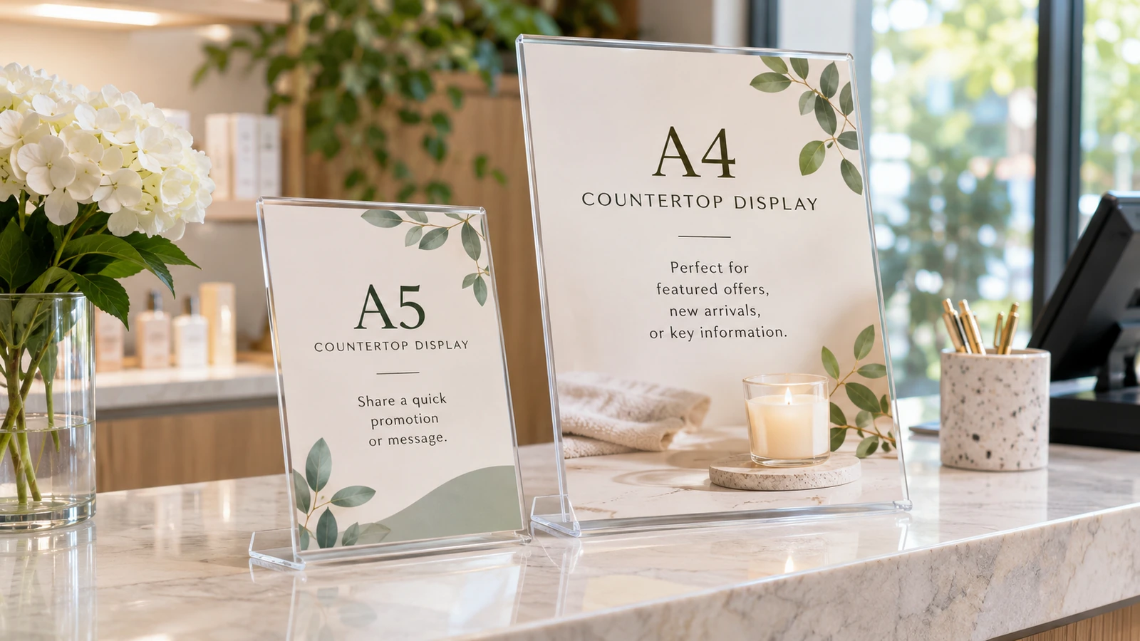
A folded tent is lightweight and useful for short campaigns, but its stability depends on paper stiffness, fold geometry and base spread. A flat printed card in an acrylic holder allows quick artwork changes without reprinting the support. A rigid stand may suit longer campaigns, particularly where customers regularly touch or move items around.
Test each option against the cleaning routine. Countertops may be wiped with damp cloths several times each day, so absorbent uncoated paper close to the surface may mark quickly. A protective finish can reduce handling damage, although it introduces its own glare and recyclability considerations.
For promotions that change weekly, calculate the effort of replacement as well as the unit print cost. A reusable holder can save setup time even when the initial hardware costs more.
Make the main message readable at a glance
Use one primary message such as a limited-time service, a short product benefit or a scan-to-quote action. The exact hierarchy matters more than the number of decorative elements. A customer standing one metre away will not study four competing paragraphs while making a payment.
Arrange content in descending importance: headline, supporting proof or offer explanation, then the action. Keep contact methods and disclaimer text legible without allowing them to dominate the layout. If a QR code is used, give it enough clear space and test scanning on the finished printed card rather than solely on a monitor.
Print a quick proof and view it from the customer position with real reflections and nearby packaging. Strong contrast usually reads more reliably than a pale design using thin fonts.
Allow for folds, scoring and trim tolerance
A scored fold helps heavier card stock bend with less cracking, but the direction of the paper grain and coating also influence the outcome. Place critical wording away from the fold and avoid designs that depend on an exact zero-tolerance junction between panels.
Ask the printer which finished dimensions and bleed settings are required for the chosen construction. Artwork that is correct for a flat flyer is not automatically correct for a tent card with a glued base or locking tab. A printable dieline or physical sample should be approved before producing a large quantity.
Check the assembled sign after folding. A perfect flat print can still show a reversed back face, uneven alignment or artwork hidden behind the base if the imposition was misunderstood.
Choose surface finishes for the actual lighting
Gloss can make colours appear lively but may reflect overhead spotlights and obscure small writing. Matte treatments generally reduce direct glare, though some coatings can darken colours or show scuffs. The right choice depends on indoor lighting and the expected number of handling cycles.
Mock up the card under the same lighting conditions as the counter. A restaurant display beneath warm pendant lighting behaves differently from a retail counter near a bright front window. If customers need to read a QR code or fine terms, lower glare can be more valuable than maximum shine.
Keep the finishing specification consistent with the expected campaign duration. Do not pay for elaborate finishing on a disposable one-day sign without a clear business reason.
Proof the assembled sign, not only the artwork PDF
A practical approval sequence begins with a visual proof, continues with a printed colour and legibility check, and ends with physical assembly. Verify the fold, score, base, scan response and stability by placing the card where it will be used.
JCP advertises paper printing and display services; confirm the required board, scoring and finishing with the supplier rather than assuming every construction is standard. If production limitations require a material change, repeat the assembled test because the stiffness and footprint may change.
Keep the approved sample or clear front-and-back photographs with the artwork filename. Reorders will be easier if the folding arrangement and final display orientation are recorded instead of relying on memories of the first campaign.
Before approving production
- Measure the usable counter depth with the payment terminal, samples and normal staff handover space in position.
- Confirm whether quoted dimensions refer to a flat sheet, a finished tent face or an assembled stand.
- Test the headline, QR code and any required terms at normal customer viewing distance under the real lighting.
- Check material stiffness, scoring direction, fold geometry and whether the erected sign rocks when lightly touched.
- Keep a photographed, fully assembled approved sign alongside the artwork revision so the next reprint uses the correct fold.
Frequently asked questions
Is A5 always better for a counter?
No. A5 can reduce clutter, but the right size depends on viewing distance, message length and the usable counter area.
Can a tabletop QR code be too small?
Yes. Test the finished print with several phones in the actual lighting and at a normal customer distance.
Do folded signs need scoring?
Heavier or coated stocks often benefit from scoring, subject to the printer’s recommended construction.
What proof should I approve?
Approve the fully assembled sign, including fold direction, base stability, readability and any QR-code destination.
Preparing a similar project? Confirm your material, artwork and sample requirements before ordering. For available apparel, print and display services, see the JCP printing service overview and request a project-specific quotation.