

Flyers or Folded Brochures? Choosing the Right Business Handout
Compare flyers with folded brochures for marketing, including reading flow, paper choice, artwork preparation and print quantities.
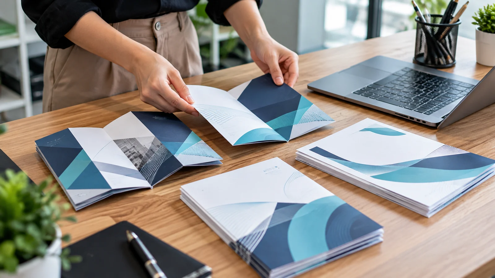
A printed handout only works when the reader can understand what to do with it. Businesses sometimes order a folded brochure because it looks more substantial, or a one-page flyer because it seems cheaper, without first deciding how much information needs to be conveyed. For a Singapore sales, service or retail team, the right format should guide a customer quickly from curiosity to a useful next step.
A flyer can be ideal for a single offer, a temporary promotion or a concise service menu. A folded brochure provides more room to organise multiple services, instructions or product families. Neither format guarantees better results. The choice depends on how it will be distributed, how long readers may keep it and the information that must remain clear without someone explaining it.
Start with a clear reading journey
For a flyer, identify one primary message, one compelling benefit and one call to action. Resist the urge to list every available service in tiny type. An A5 or A4 sheet has limited visual space, and a cluttered layout weakens its purpose. Use a headline that answers a customer question, readable supporting text and contact information that can be found at a glance.
A folded brochure can guide the reader through a sequence: a promise on the cover, useful detail inside and next steps on the back. This structure works when the product has several options or when a service needs some explanation. Map what appears on each panel before designing; folds change how the reader encounters the information and can affect where images or diagrams should sit.
Match paper and finish to handling
Lightweight paper may be suitable for one-off distribution, while thicker stock can feel sturdier when material is expected to sit on a counter for weeks. Finish changes both appearance and usability. Gloss can make colour photographs look lively but may show glare under strong lights; a matte surface can be easier to read, though the specific result depends on stock and coating.
Ask for physical paper samples rather than judging a finish entirely from a screen. Think about whether someone needs to write on the handout and whether the surface accepts pen ink readily. For folded items, check how the chosen stock creases; thicker paper may benefit from scoring. Poorly planned folds can crack heavily inked areas or leave a brochure that does not close neatly.
Understand quantity and revision costs
The cheapest unit price is not always the best total decision. A large print run may reduce cost per copy but create waste if prices, service names or contact details change soon afterwards. Small digital runs may support revisions and targeted messages, while some high-volume jobs suit other production methods. Confirm current minimums and turnaround for the exact specification rather than relying on a generic marketing promise.
Before ordering, decide how many pieces staff can reasonably distribute within the campaign period and keep a little reserve for unexpected demand. JCP’s loose-sheet printing service information explains how formats and run sizes can vary, while the wider printing service overview helps connect handouts with display signage or branded apparel for a coordinated campaign.
Design for print, not just a phone screen
Artwork should be checked at actual printed size. Supply high-resolution photography, suitable bleed and safe margins, and verify that QR codes scan after printing. Folded brochures need special attention to panel order and orientation; a mockup viewed on-screen may hide a reversed panel or text too close to a crease. Proofreading must include telephone numbers, URLs, dates and any prices that are likely to change.
A physical proof is especially useful when colours, special finishes or accurate folds are important. Ask one person unfamiliar with the draft to read it and explain what they think the next action is. If they cannot do so quickly, editing the message often produces more value than adding another graphic. You can align future uniforms and printed collateral through the Singapore Uniform site as part of a consistent presentation plan.
Questions to answer before printing
- Is the goal a quick offer, a service explanation or a leave-behind reference?
- How many words and images are genuinely needed?
- What paper stock, final size, fold and finish will be used?
- How many copies can be distributed before the information changes?
- Who approves the final proof, URLs and contact details?
Decide how the handout will reach people
A flyer placed in a shopping bag faces different conditions from a brochure handed to a client during a meeting. A high-volume street handout may be read for only a few seconds, while a presentation brochure could remain on a desk for months. Those differences influence paper choice, the amount of copy and where contact details should appear. Consider whether staff will speak while handing it over or whether the print must stand alone.
For reception counters, test how a small stack appears from a customer's viewpoint. Does the headline remain visible and does the material fit the available holder? If brochures are mailed, fold and weight may affect packaging and postage. If they are included with product orders, make sure the sheet lies flat without bending. Distribution constraints are design requirements, not details to solve after printing.
Compare two proofs with a practical audience test
Show a simplified flyer and a folded brochure draft to colleagues who were not involved in the project. Give them half a minute with each, then ask what the product is, whom it suits and what action they would take next. If answers vary widely, refine the headline and information hierarchy. Adding more decorative graphics usually will not solve a message that is fundamentally unclear.
Also proof the item under the lighting where it will actually be used. Fine white text on a dark background may look attractive on a bright monitor yet be difficult to read on a glossy sheet. Confirm that the paper fold does not hide important details and that any QR code has enough quiet space. A small sample run can be valuable before committing to a large distribution quantity.
Common questions
Is a tri-fold brochure always more professional?
Not necessarily. A well-designed single-sheet flyer can look more polished than a crowded brochure. Choose the simplest format that communicates the information clearly.
Can I reuse social-media artwork for print?
Sometimes, but dimensions and resolution often differ. Recheck layout, contrast, text size and bleed for the intended physical size before production.
Is matte always easier to read than gloss?
Matte can reduce certain reflections, but readability also depends on contrast, font size, lighting and paper colour. Compare physical proofs in the environment where readers will use them.