

Printing & Branding
Spot Colour vs CMYK Printing: A Brand Colour Proofing Checklist
A brand guide may define one signature blue and one warm yellow, yet those colours can appear different on a brochure, label, promotional folder and display board. This does not automatically mean a printer made a mistake. Printing methods, stock colour, inks, coatings and lighting all affect the result. Before demanding an identical appearance, the buyer needs to understand whether a job calls for dedicated spot ink, four-colour process or a controlled approximation.
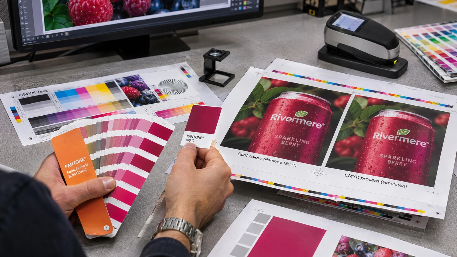
Understand what each colour system actually controls
CMYK uses cyan, magenta, yellow and black process inks in combinations to simulate a broad range of colours. Spot colour uses a separately specified ink for a particular colour when the production method supports it. Neither term by itself guarantees perfect consistency across every substrate, coating or machine.
For a design with many photographs and gradients, process printing is often practical. A simple logo that depends on one precise corporate hue may benefit from a specified spot-colour workflow where supported. But the available options depend on quantity, equipment and the supplier, so the design should not dictate an unrealistic process without a production discussion.
Ask the printer whether the requested colour is being produced as a dedicated ink or converted into CMYK. Record that decision in the quotation and approval record; otherwise different team members may assume different meanings of “match our brand blue.”
Treat the physical substrate as part of the colour
An uncoated cream paper absorbs ink and reflects light differently from a smooth white coated stock. A dark fabric printed with light ink involves different underlying conditions again. Even on paper, gloss film can alter perceived saturation and contrast after finishing.
For an identity appearing on letterheads, brochures and signage, specify the material alongside the colour reference. A promise to match a numeric colour value without naming the stock is incomplete. If consistency matters, compare samples printed on the actual materials rather than only a universal colour chart.
Prepare a small brand-colour hierarchy: the core standard, a reasonable process approximation where necessary and any preapproved alternative for dark backgrounds. This is more workable than expecting all media to reproduce one hue identically.
Check source files and conversions
Artwork supplied in RGB may look luminous on a monitor but shift when converted to a process-print profile. Designers should preserve approved swatches, clearly identify spot-colour objects and avoid accidental duplicate swatch names. Flattening a logo into a screenshot can remove the information a prepress operator needs.
Ask for the printer’s preferred file format, bleed and colour profile. If a file contains transparency or placed photographs, review how the conversion affects edges and overprint. A small colour patch beside an image can be useful, but it must not introduce a new visible object into the final customer-facing artwork.
Before approval, compare the print-ready proof with the original brand artwork. Check logos, reversed white elements, dark areas and any small text that may change appearance after conversion.
View proofs in consistent lighting
Human colour judgement changes under warm office lamps, bright daylight and cool retail lights. A proof held near a window should not be compared with a product sample under a yellow desk lamp. Where colour accuracy is commercially important, agree on a consistent viewing condition and note whether a visual or instrument-based tolerance applies.
Do not judge an image from a photograph of the proof sent through a messaging app. The camera, screen and compression introduce additional colour changes. Use such photos for layout approval, but obtain an actual printed sample or controlled supplier confirmation when the brand colour is a critical requirement.
Make colour approval traceable: name the file revision, paper stock, print method, approved reference and person authorising production. That record protects both buyer and supplier.
Plan how a logo behaves on fabric and signage
Brand identity may be applied by embroidery, heat press, sublimation, screen printing and large-format output. Threads, film, dyes and inks have different colour ranges and surface effects. A colour specified for paper should be translated deliberately for each method rather than copied without checking feasibility.
JCP lists apparel decoration and banner or display printing services, so a cross-material branding project is an appropriate subject for discussion. However, exact colour control and available special-ink workflows must be confirmed with the production team for each item.
Build a practical approval pack containing a printed-paper reference, a decorated fabric sample and a relevant display sample where budgets justify it. This gives future reorder teams something more reliable than an old smartphone photograph.
Write a useful colour acceptance note
An approval note should distinguish the most important brand elements from colours that may vary within an agreed range. It can state that the logo background must remain legible, that certain spot colours must not be silently converted and that printed material changes require a reproof.
If no numeric tolerance is agreed, avoid suggesting that a subjective visual match will be perfectly reproducible in every job. Instead document the physical approved sample and the specific production conditions. For a low-cost short-run flyer, a sensible process approximation may be acceptable even when a premium presentation folder merits a tighter review.
The strongest control is early agreement. A small proofing budget before a large order is usually easier to manage than reprinting thousands of pieces because “the blue looked different.”
Before approving production
- Supply the brand-standard reference, along with a note identifying which colours are essential and which may use an approved process approximation.
- Record whether the supplier proposes dedicated spot ink or CMYK simulation for each particular printed product.
- Specify the actual stock and finish before comparing swatches; identical artwork can look different on gloss, matte and uncoated paper.
- Approve the physical colour proof under a consistent viewing condition and keep the printed sample for future reorders.
- Inspect overprint, reversed lettering and small details after conversion of source artwork to the printer’s requested colour profile.
- When branding fabric as well as paper, approve separate material samples rather than claiming one RGB screen image proves both outputs.
Frequently asked questions
Is spot colour always more accurate?
A dedicated ink may improve control for a specified colour, but stock, equipment and finishing still affect appearance.
Can CMYK reproduce every Pantone shade?
No. Some spot colours fall outside the practical gamut of a given CMYK print condition.
Why do print and screen colours differ?
Screens emit RGB light while printed materials reflect ambient light; gamut and surface characteristics differ.
What should I approve for reorders?
Keep the physical reference, material specification, process, artwork revision and an explicit approval record.
Preparing a similar project? Confirm your material, artwork and sample requirements before ordering. For available apparel, print and display services, see the JCP printing service overview and request a project-specific quotation.