

Printing & Branding
Silkscreen Colour Separations: Preparing Two- and Three-Colour Shirt Artwork
A striking two-colour shirt graphic can become a frustrating print job if the file does not distinguish its inks properly. Artwork that looks complete on a monitor may rely on transparent effects, blended edges or nearly identical shades that do not translate cleanly into separate screens. The most useful preparation starts by deciding what each ink actually prints, how layers overlap and what the design must look like on the chosen fabric. This is a production conversation rather than a software shortcut.
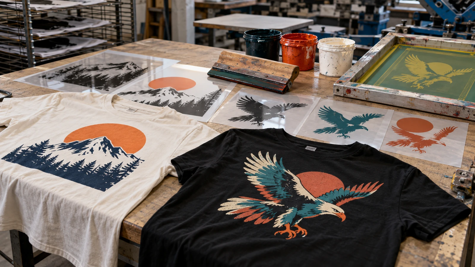
Begin with an explicit ink map
A two-colour design should identify two actual ink colours, not merely contain a thousand shades that resemble two families. Label the artwork components by production colour and record a physical or agreed reference for each shade. Gradients, drop shadows and antialiased edges can introduce intermediate pixels that complicate separation. If the visual effect depends on a fade, decide whether halftone screening is appropriate and confirm the print shop can reproduce it within the required detail.
Keep the garment colour separate from printed ink. A black shirt showing through an unprinted area is not necessarily a third colour, but white highlights may require an additional ink. Clarify this before pricing. Use vector shapes where possible for crisp text and symbols. Where raster artwork is unavoidable, supply adequate resolution at final print dimensions and avoid repeatedly enlarging compressed previews.
Decide whether an underbase is required
Bright inks printed on dark fabric can behave differently from those on white fabric. An underbase may be used to help a chosen colour retain opacity, but it is a separate production decision with its own alignment and hand-feel implications. The correct approach depends on ink system, garment, design and machine setup. Do not assume that a white underbase can be added invisibly beneath every small line without changing edge quality.
Identify the print order and whether any intentional knockouts are present. For example, allowing the shirt colour to show through a leaf illustration can reduce ink coverage, while printing that negative space as a dark ink would add unnecessary weight. Agree on the intended final appearance rather than asking the printer to infer it from a rendered T-shirt mockup. A physical test is especially valuable on dark or textured material.
Treat registration as a design constraint
Each ink is deposited through a separate screen, so perfectly shared borders are harder than they appear in a digital file. A thin hairline that must align with a second-colour outline may expose unwanted gaps if alignment varies slightly during a production run. Small overlaps, trapping or a modified border can make a design more forgiving. The correct allowance depends on the printer's setup and artwork scale; it should not be guessed as one universal number.
Inspect the design at its actual printed size. A small crest with three nested colour rings needs more care than a large two-colour block. Ask whether thin outlines or tiny reversals are necessary to communicate the identity. Simplifying microscopic details can improve perceived quality even when it means departing slightly from a screen-only rendering. If a logo must remain exact, request a pre-production sample and obtain brand-owner approval.
Check halftones and fine typography realistically
When an illustration uses tonal variation within one ink, halftone dots can create a visual gradient. The dot shape, ruling and angle need to be compatible with the screen mesh and chosen fabric. Very subtle fades may disappear or merge on rough garment surfaces. Rather than forcing a photographic result through an unsuitable setup, test a simplified spot-colour treatment that keeps contrast and character.
Typography needs the same attention. A very thin serif may look elegant on a monitor and become patchy when printed through fabric texture. Consider minimum strokes, counters in small letters and negative space between neighbouring shapes. Print a one-to-one paper proof and look at it from the normal viewing distance. If a line is only visible when zoomed to 400 percent, it is a warning sign for production.
Prepare a proof that production can interpret
Send a final-size artwork file, a flattened full-colour reference, a garment-colour reference and a simple list of ink colours. Identify front/back orientation and measured distance from a stable garment reference point, such as centre front or collar seam. If sleeves or side seams affect the design, show them in a mockup while keeping the actual print file separate. Include the name and version number so the latest approved artwork cannot be confused with an earlier revision.
Do not leave spot-colour names as “blue copy 2” or “new red final.” Use sensible, descriptive names that can be discussed during setup. Verify that fonts are outlined or supplied in an accepted form, and remove hidden layers or old logos. A supplier should be able to understand the intended inks without recreating design decisions from screenshots.
Approve the first print, not just the monitor proof
A digital approval establishes composition but cannot demonstrate opacity, tactile finish, registration or ink colour on the real garment. Request a first article or production sample when the artwork is sensitive. Compare the physical result with the agreed standard under consistent lighting. Pay attention to the print edge, tiny text, overlap areas, and whether the graphic feels too heavy where multiple inks stack.
JCP offers silkscreen apparel customisation, which makes an artwork discussion relevant before a corporate or event order. Confirm the actual production setup and acceptance tolerances directly rather than assuming every printing method uses the same file rules. Preserve a photograph and, where possible, a retained approved sample for later repeat orders. This prevents a reprint from drifting away from the original intention.
Frequently asked questions
Can a JPEG be used for two-colour silkscreen?
A JPEG can serve as a visual reference, but editable separated artwork is safer. Whether a printer can recreate separations depends on resolution, edges and agreed artwork-preparation scope.
Does a dark shirt always require a white underbase?
Not always. Ink type, opacity targets and the design influence the decision. Ask the producer to confirm whether an underbase is needed and whether it counts as an additional colour.
What is colour trapping in screen printing?
It is a small intentional overlap or adjustment between adjacent ink areas to reduce visible gaps if separate screen positions vary slightly.
Is a digital mockup sufficient for colour approval?
No. A mockup helps with placement and appearance, but a physical sample is needed where exact ink colour, registration and hand feel are important.
Before you approve the order
Before you issue a purchase order, compare the separated artwork to the full-colour intent at final size. Confirm the shirt colour, individual inks, any underbase, acceptable fine detail and print placement. Once a sample is approved, lock the artwork version. Good screen printing begins with disciplined files and specific decisions, not with an attractive mockup alone.