

What Tiong Bahru Cafés Should Check Before Ordering Staff Aprons
Tiong Bahru mixes independent cafés with established food stalls and neighbourhood retail. For a café team, aprons are equipment: staff wear them while moving between counters, espresso stations and customer tables. Here is how to judge an apron before you commit to an entire team order.
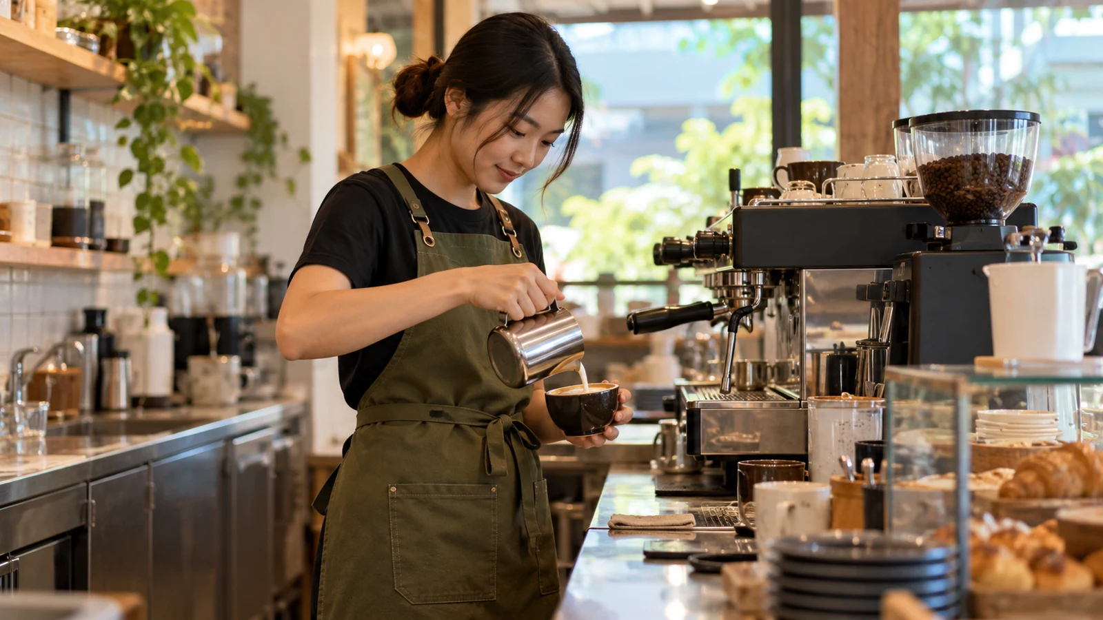
Follow the work, not just the visual style
An apron for the person taking orders does not need the same storage as an apron for the person constantly carrying trays, towels and utensils. Start by watching a normal shift: where do staff keep a pen, order pad, payment terminal or cleaning cloth? A chest-high bib gives more coverage for coffee preparation, while a waist apron can feel less restrictive for a front-of-house host. Test the pocket opening with real objects before agreeing to a bulk design.
Think about which tasks require bending or reaching across a counter. A pocket placed too low can catch on a table edge, and an overfilled front pocket can pull an apron forward. Give employees enough freedom to reach shelves without constantly adjusting the neck strap. A practical sample worn during one actual shift is more useful than judging the apron only while it hangs flat.
Choose fabric for washing and movement
Canvas has a structured appearance and can hold a tidy shape, but weight and drying time matter on long shifts. A lighter poly-cotton construction may feel easier in a warm service area, provided its durability and hand-feel match the task. Ask to touch the fabric, check whether it shows marks readily and compare how it looks after washing. Dark colours hide some everyday marks but they do not replace proper cleaning.
Check the manufacturer’s care label instead of assuming every apron tolerates hot washing or bleach. Wash a sample using the routine your business actually follows, then look for shrinking, twisted seams and puckering around embroidery. A design that looks premium before first use should still sit neatly after repeated laundering. Include a simple care note when issuing aprons to casual or rotating staff.
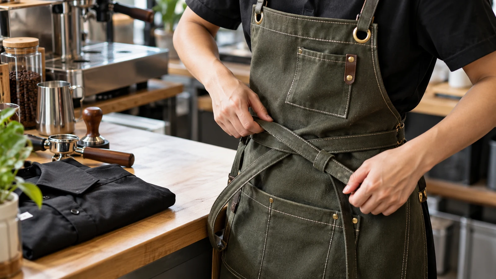
Make straps and pockets do real work
An adjustable neck loop suits teams with different heights, but a cross-back strap may distribute pressure more comfortably for someone wearing an apron for many hours. Examine buckles, ties and reinforced pocket corners as closely as you examine fabric colour. If a staff member handles heavy items, keep sharp tools in an appropriate secured holder rather than a loose fabric pocket. A pocket arrangement that works for one role may be inconvenient for another.
Size ranges should be tested on both shorter and taller team members while they are moving. The bib must not cover a name identification point unintentionally, and the bottom hem should not interfere with stairs. Avoid adding pockets merely because there is blank space on the fabric. Two well-positioned compartments usually serve a clearer purpose than a row of pockets that staff never use.
Place the logo where it remains readable
A small embroidered mark on the upper bib can be effective if the logo has thick enough lines to stitch clearly. Large multi-colour graphics may need a different decoration approach depending on fabric and order volume. Keep artwork away from thick seams and strap hardware, which make accurate application harder. A clean mark with generous surrounding space often outperforms a complex print at a busy counter.
Before production, look at the intended logo from several steps away rather than only in a close-up artwork preview. If staff wear an open jacket over the apron, check whether it hides the branding. A café logo should be legible when a customer speaks to the employee; an oversized visual is not automatically better. Request a placement mock-up on the real apron colour, not a plain white rectangle.
Why Tiong Bahru’s café mix makes an apron trial worthwhile
A compact specialty café and a busy market-side food business may both want tidy uniforms, but their employees reach for different tools. On a narrow coffee counter, pens and cloths need predictable pockets; in table service, a slimmer waist apron may be easier to move in. The area’s range of small food operators is a reminder to design around the task rather than a generic hospitality photograph.
Tourism Singapore has long highlighted the neighbourhood’s mix of cafés and traditional food outlets. That observation does not imply all local cafés have the same uniform needs. A team should instead run a sample shift at its own premises and note where straps pull, pockets sag or branding is hidden. A supplier discussion will be much clearer after staff report their experience.
A quick decision table
| Situation | Start with | Test or verify |
|---|---|---|
| Barista | Chest bib and secure towel storage | Reaching to milk jug and equipment |
| Server | Easy movement and order-pad access | Pocket position when carrying trays |
| Front counter | Clean logo and approachable appearance | Visibility when behind counter |
Frequently asked questions
Should every café role wear the same apron?
Not necessarily. Keeping one colour and logo while varying bib or waist styles can make the uniform coherent without forcing different roles into identical layouts.
Is embroidery always the best apron decoration?
It can suit small, simple logos, but the fabric and artwork should determine the method. Check a decorated sample before placing a team order.
Local context: Singapore Tourism Board – Tiong Bahru neighbourhood guide. Product recommendations in this article are general purchasing considerations, not official requirements from that source.